The "Beter Verwijs" initiative by Radboudumc seeks to streamline how GPs refer patients to specialists, ensuring referrals are accurate, efficient, and contain all necessary information for optimal patient care. My role over two years was to guide this initiative from a UX perspective, initially by optimizing the existing system and ultimately by designing a completely new, user-centered digital portal for GPs.
The challenge
The existing referral process faced several challenges impacting both GPs and patient care: ensuring patients reached the right specialist quickly, equipping specialists with complete patient information upfront, reducing administrative burden for busy GPs, and avoiding unnecessary referrals. The opportunity was clear: leverage UX design to create a digital solution that transforms this process, making it intuitive, efficient, and supportive for primary care providers interacting with Radboudumc.
My approach & process
This project unfolded over two years, allowing for a deep, iterative approach:
- Phase 1: Understanding & optimizing: I began by analyzing the existing referral methods and the initial digital touchpoints. Using heuristic evaluations and analysing available usage data, I identified immediate pain points and implemented smaller optimizations to provide early improvements while building a deeper understanding of the customer journey and the platform.
- Phase 2: Deep dive research (For a solid foundation for the new portal): To design a truly effective new portal, a thorough understanding of the GPs’ context was essential. I employed a range of research methods to gather both broad and deep insights consisting of under more: User Interviews, stakholder workshops, surveys, rapid prototyping & testing.
- Phase 3: Designing the new portal (Ofcourse in Figma!): Armed with comprehensive research insights, I translated user needs and stakeholder requirements into a concrete design.
- Phase 4: Testing & Iteration: I conducted iterative rounds of usability testing on the Figma prototypes with both GPs and internal stakeholders. Feedback from these sessions was crucial for refining the design, ensuring it met user expectations and was intuitive.
The solution
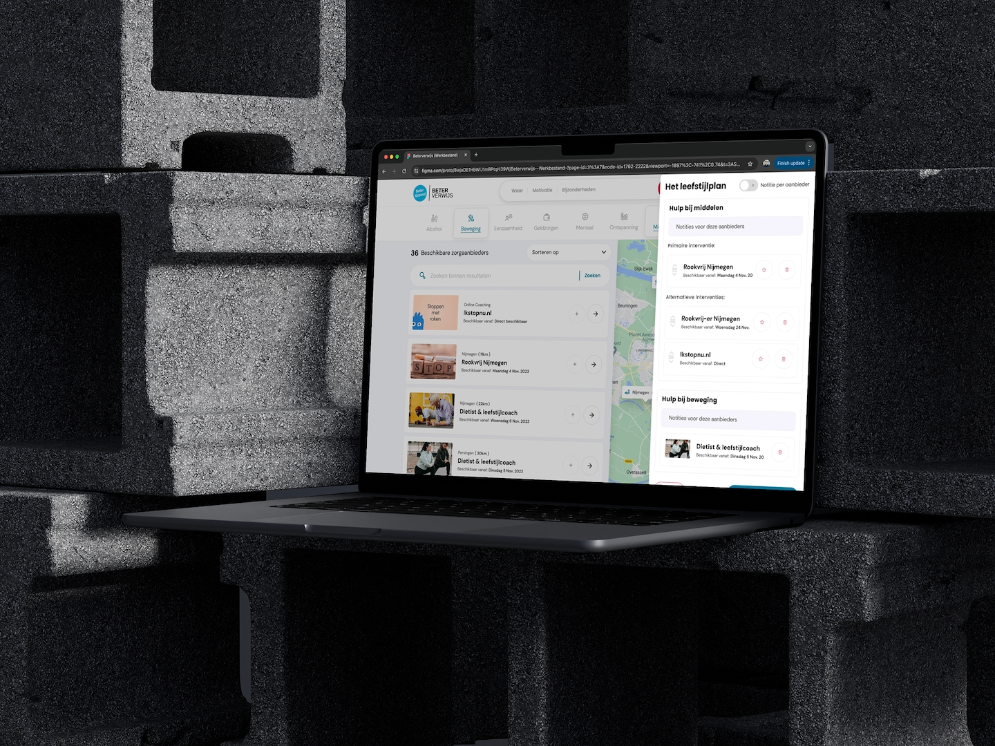
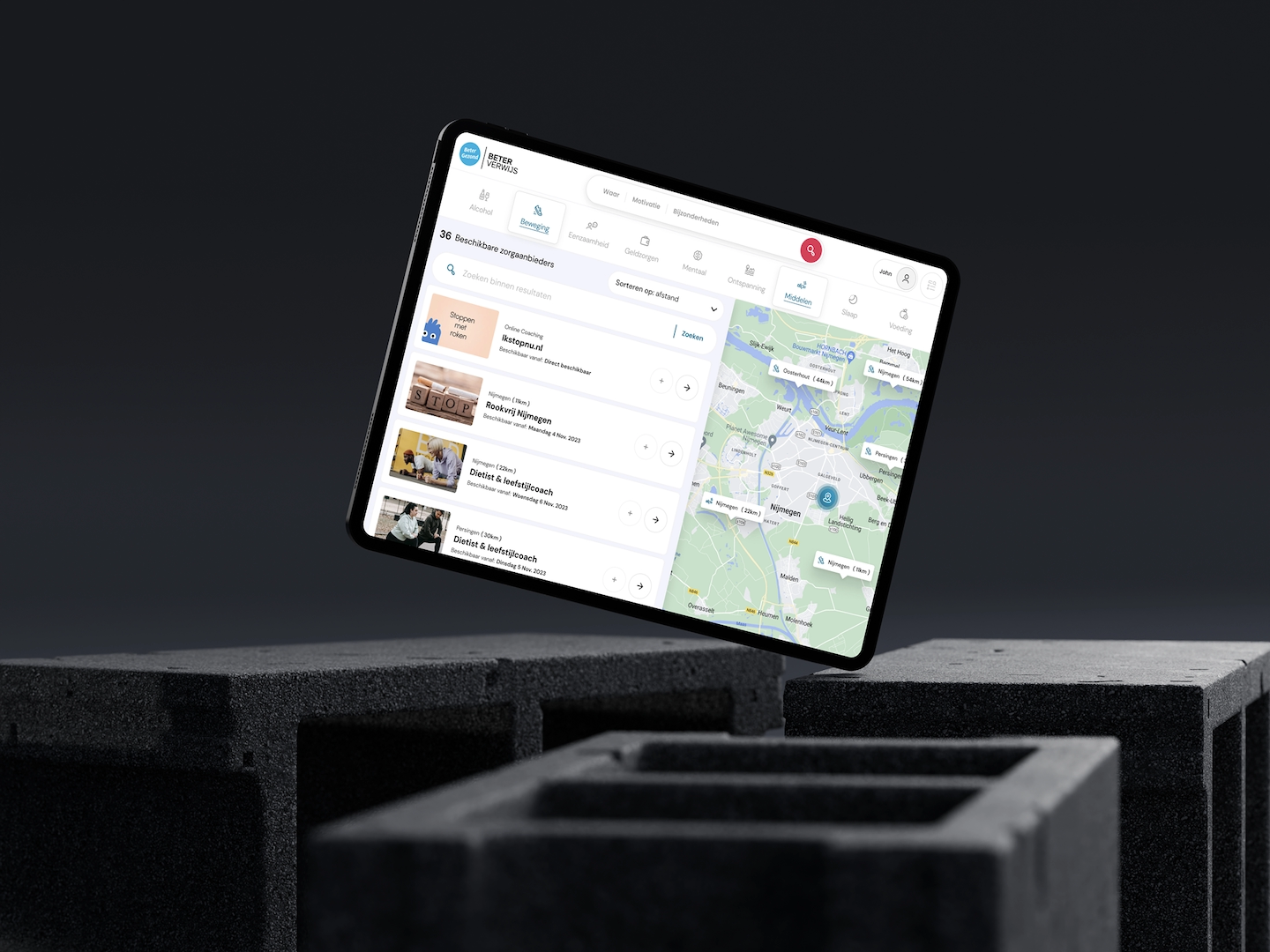
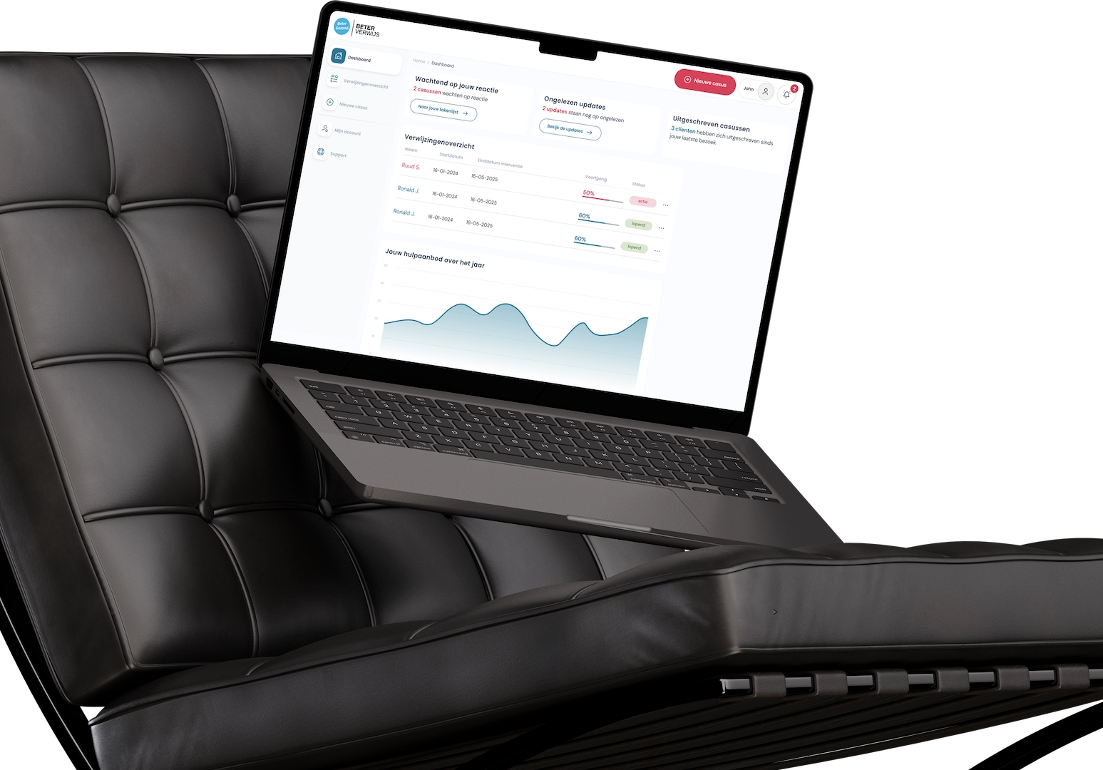
The culmination of this two-year effort is a user-centered design for the new Beter Verwijs portal, prototyped in Figma. Key aspects of the solution include:
- Streamlined referral workflow: A guided process for submitting referrals, making it easier to select the correct specialist and ensuring all required information fields are clear and contextually relevant.
- Intuitive (back-office) dashboard: A central hub for GPs to manage their referrals, track statuses, and communicate efficiently.
- Improved information access: Easier ways to find specialist information, specific referral criteria, and contact details for consultations.
- Focus on efficiency: Designed with the time-pressed GP in mind, minimizing unnecessary steps and cognitive load.
The tools used
Design: Figma
The result
As the platform is currently under development, the primary impacts are centered on the UX process deliverables and early validation:
- – User-validated designs
- – Positive user feedback
- – Clear development blueprint
- – Foundation for improvement