Thermen Bussloo provides a comprehensive wellness experience, but its extensive offerings created complexity in the online user journey. I undertook this project independently to optimize the website experience, focusing on improving information clarity, streamlining decision-making ("providing a clear choice"), enhancing storytelling, and ultimately increasing the conversion rate for bookings and package deals.
The challenge
The core challenge was to guide potential guests smoothly through the entire digital journey – from initial exploration to post-visit engagement – despite the inherent complexity of the resort’s offerings. Key friction points and optimization goals across the journey included:
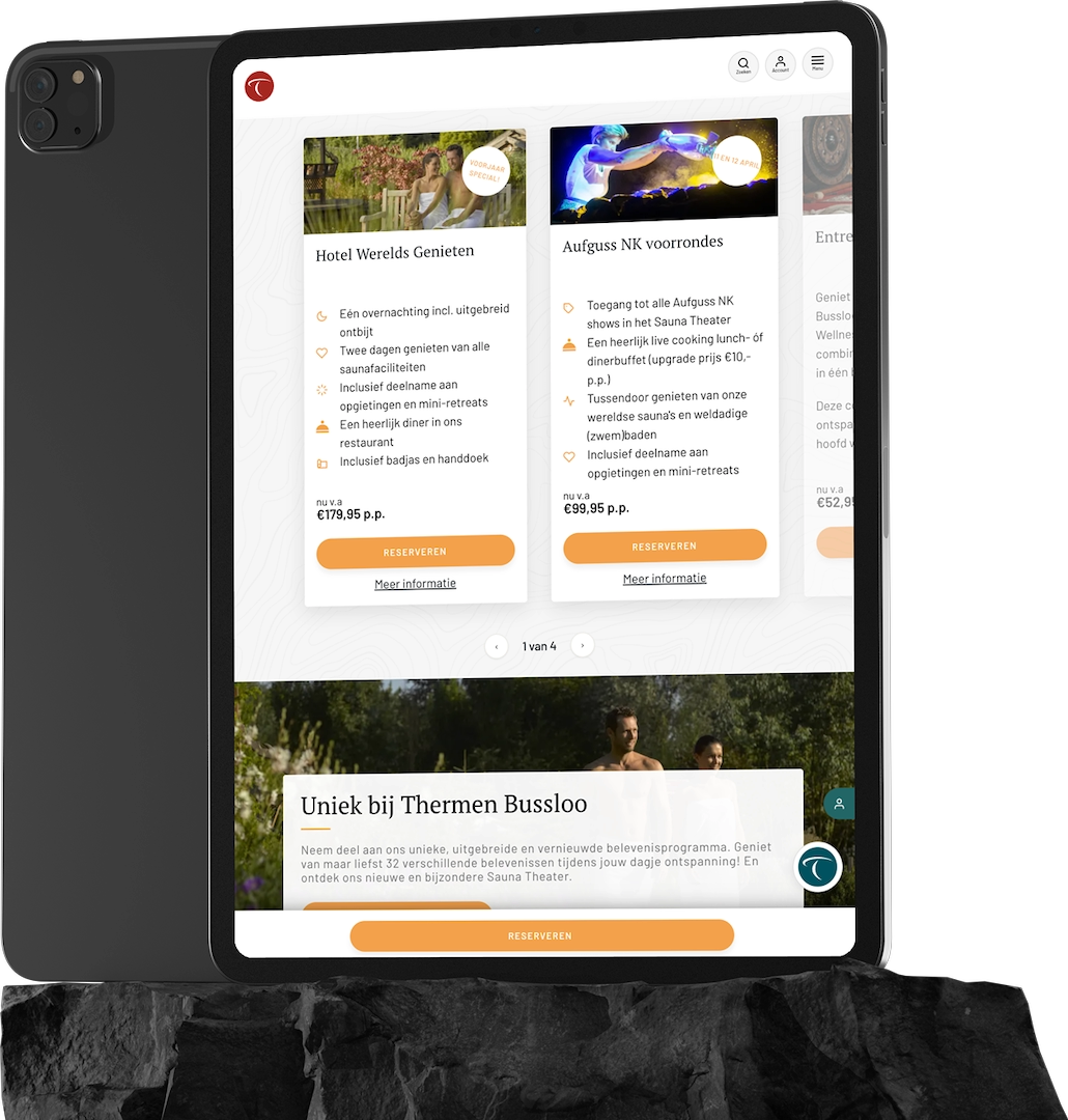
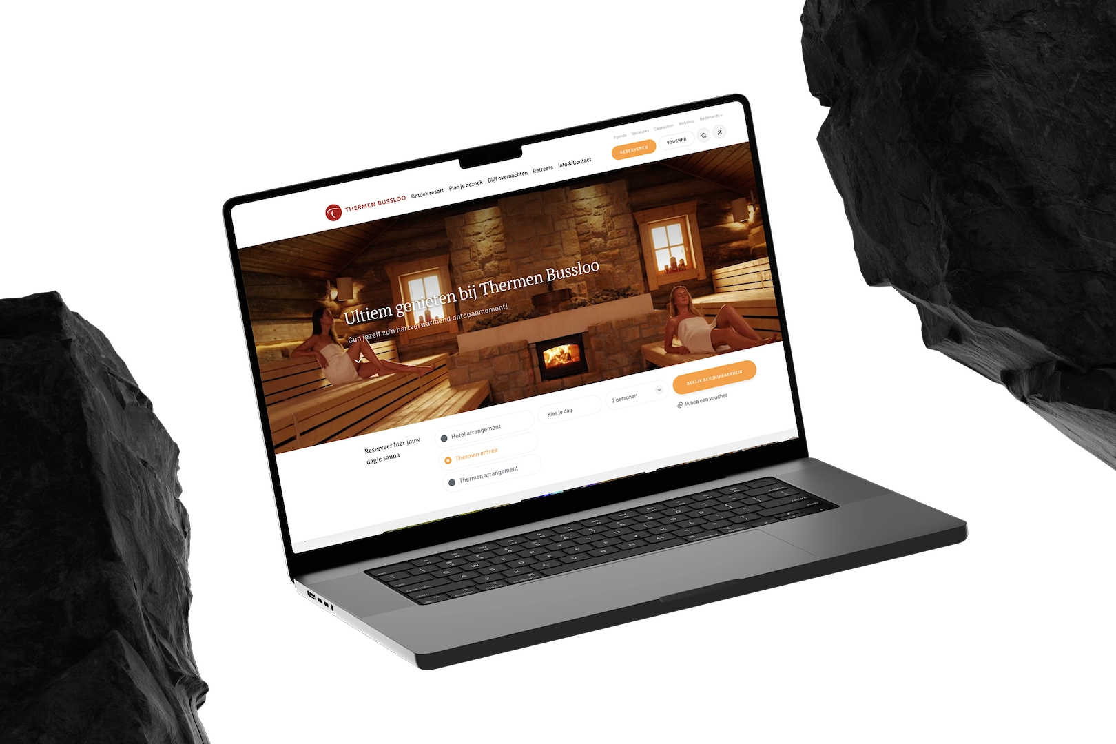
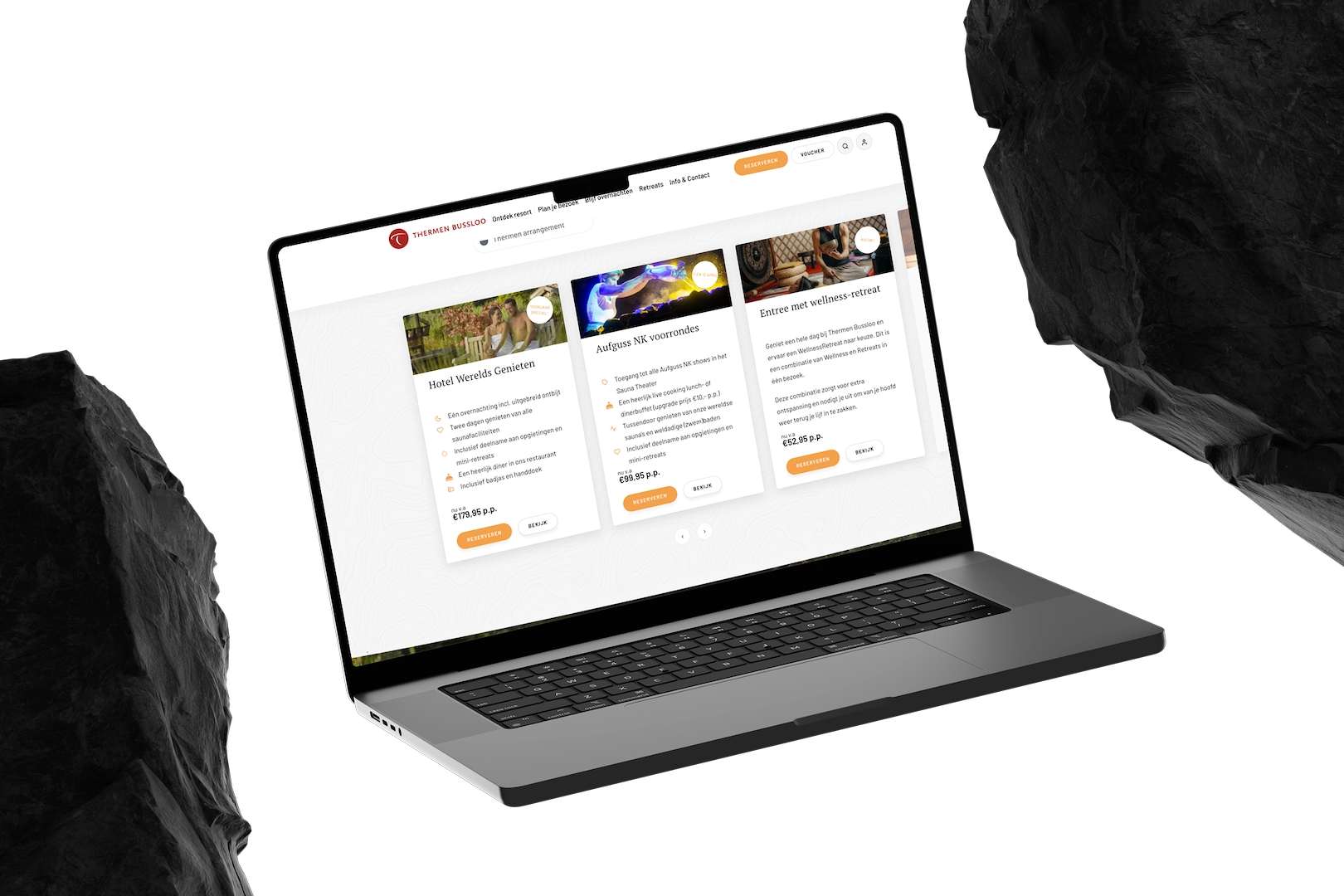
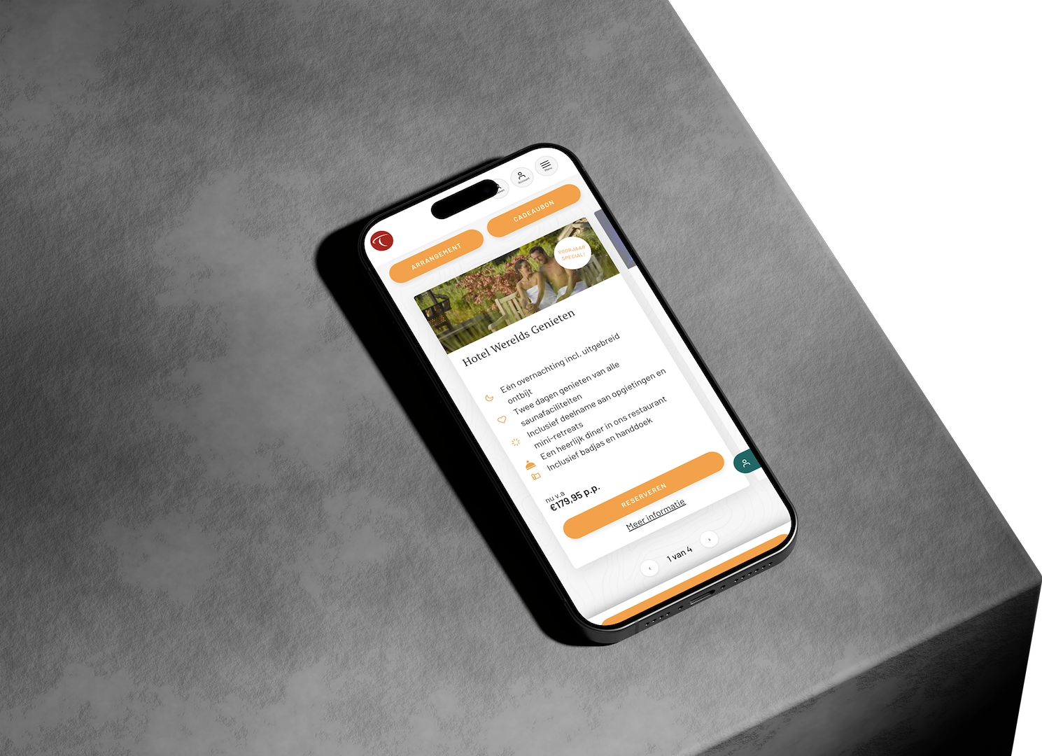
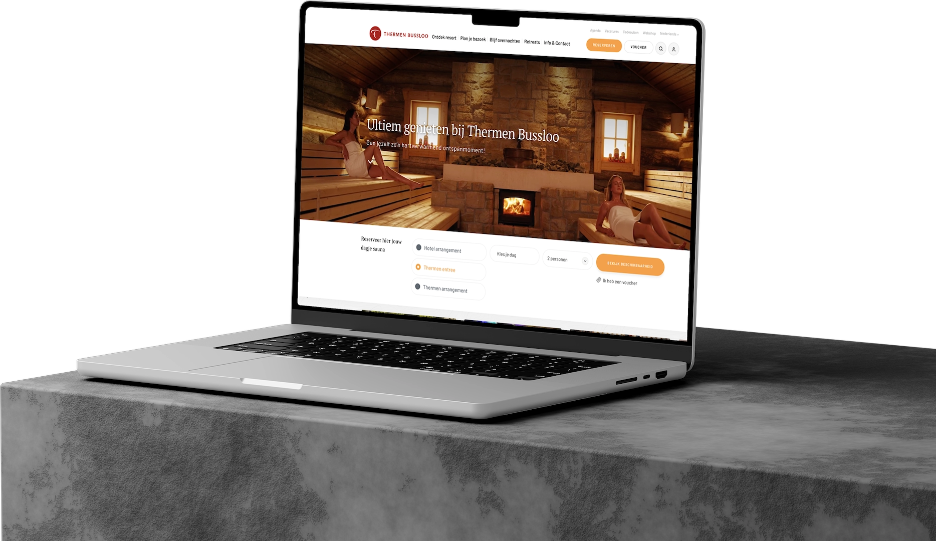
Information architecture & choice overload (planning phase): The vast array of tickets, packages, treatments, and facilities was overwhelming. I needed to simplify navigation, improve categorization, and implement effective filtering to help users easily find and compare options matching their specific needs (relaxation, treatments, getaway type) without feeling lost.
On-site experience (Digital touchpoints): While much of the on-site experience is physical, digital touchpoints (like app maps, schedules for rituals, wristband payment info) needed to be intuitive and helpful, enhancing rather than disrupting relaxation.
My approach & process
My process was data-driven and obviously iterative, focusing on understanding user behaviour and validating changes. Not everything is as we expect:
I started by thoroughly understanding Thermen Bussloo’s business goals and target audience. I then dove into user behaviour data using tracking tools to identify where users struggled, dropped off, or hesitated in the existing online journey. This quantitative data provided crucial insights into real-world friction points.
Based on the data analysis, I pinpointed specific areas in the user flow and information architecture that were likely hindering conversion and causing confusion. I formulated hypotheses about how specific changes could improve clarity and task completion
The core of the optimization process involved using VWO (Visual Website Optimizer) to conduct A/B tests. I pitted my redesigned variations against the original pages, measuring the impact on key metrics like click-through rates, bounce rates, and ultimately, conversion rates. This allowed me to make data-backed decisions rather than relying on assumptions.
Based on the A/B test results, I either rolled out successful variations or further refined designs that didn’t perform as expected, continuing the cycle of analysis, design, and testing.
The solution
I implemented several key optimizations to the Thermen Bussloo website. These included:
- Redesigned package presentation: Simplified how packages were displayed, making comparisons easier and highlighting key benefits relevant to different user needs.
- Improved information hierarchy: Restructured content on key landing pages to prioritize essential information and guide users more effectively towards booking options.
Streamlined call-to-actions (CTAs): Clarified and repositioned CTAs to make the next step in the booking process more obvious.
These changes were directly aimed at reducing choice overload, clarifying the value proposition, and making the path to conversion smoother for potential guests.
The tools used
Design & optimisation: Sketch, VWO (A/B testing), Jira (for project tracking)
The result
- Improved user flow: Analysis showed users navigating more efficiently through the optimized paths.
- Validated design enhancements: A/B testing confirmed that the implemented changes positively impacted user behaviour and progression towards booking.
- Increased conversion rate: While specific numbers depend on the tests run, the methodology directly targeted and achieved improvements in the site’s conversion performance, demonstrating the value of UX optimization for business goals.